The 6 Best AI Data Visualization Tools For Everyone

I’ve tested every AI data visualization tool I could find.
I uploaded the same datasets, asked the same questions, and compared the results.
Most were garbage.
You know the type: chatbots that occasionally spit out charts, or dusty enterprise tools with an “AI” sticker slapped on the box.
But six tools changed how I think about data.
Best for collaborative data notebooks
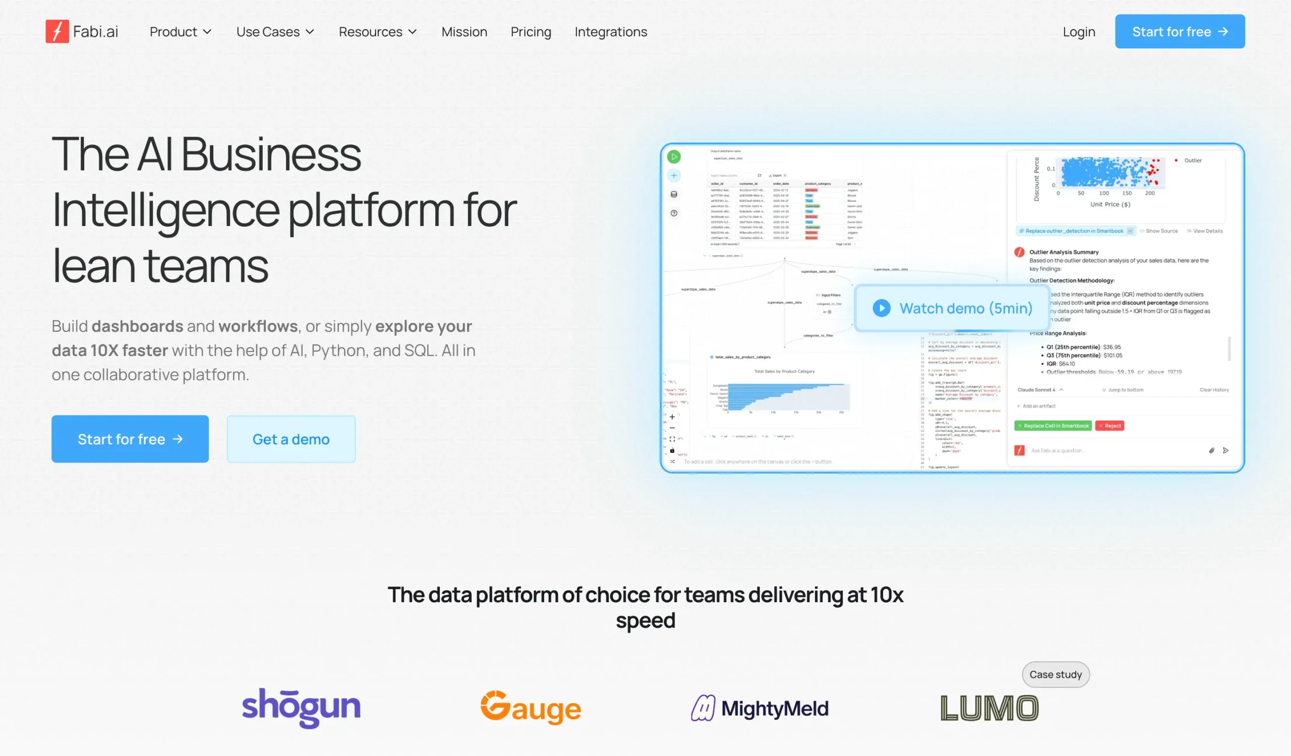
Fabi.ai
Perfect for: Teams who want SQL, Python, and AI in one place
Pricing: From $39/month
AI-powered notebooks with proper state management. Combines SQL, Python, and AI in reactive cells. Auto-pushes reports to Slack, Google Sheets and more.
AI-powered data workflows and automation
Julius AI
Perfect for: Data teams building repeatable analysis workflows
Pricing: From $20/month
Advanced AI data platform with Notebooks for repeatable workflows, direct database connectors, and support for latest models. Build once, automate forever.
Best for custom development
Claude
Perfect for: Technical users wanting complete code control
Pricing: From $20/month
General AI assistant excelling at data visualization through natural conversation. Provides complete React code and intelligent chart recommendations.
What are the best AI tools for data visualization?
Tool | Best for | Standout features | Pricing (monthly billing) |
|---|---|---|---|
Fabi.ai | Collaborative data notebooks | Smartbooks fix Jupyter’s state problems; specialized AI agents with defined datasets; auto-pushes to Slack/Google Sheets | Free plan available; Builder from $39/month |
Julius AI | AI-powered data workflows | Notebooks for repeatable analysis; database connectors; latest AI models (Claude 4 Sonnet, GPT-5); workflow templates | Free plan available; Plus from $20/month |
Claude | Custom development | Complete React code access; natural language processing; intelligent recommendations | Free plan available; Pro from $20/month |
Zoho Analytics | Enterprise data environments | 500+ data source connections; Zia AI assistant; 50+ chart types | From $12/member/month |
Infogram | Professional exports | 5 export formats; 35+ chart types; direct database connections | Free plan available; Pro from $25/month |
Datapad | Real-time monitoring | Watchtower anomaly detection; 20+ data source connections; automated KPI tracking | Free plan available; Standard from $30/month |
How I picked
#1 — Fabi.ai
Available on: Web
Pros
Cons
I’ve been looking for a good data visualization tool. Fabi.ai is the best I’ve found.
Why?
Because it does what most tools don’t: it lets you talk to your data in plain English and get actual insights back. No SQL required (though you can use it if you want).
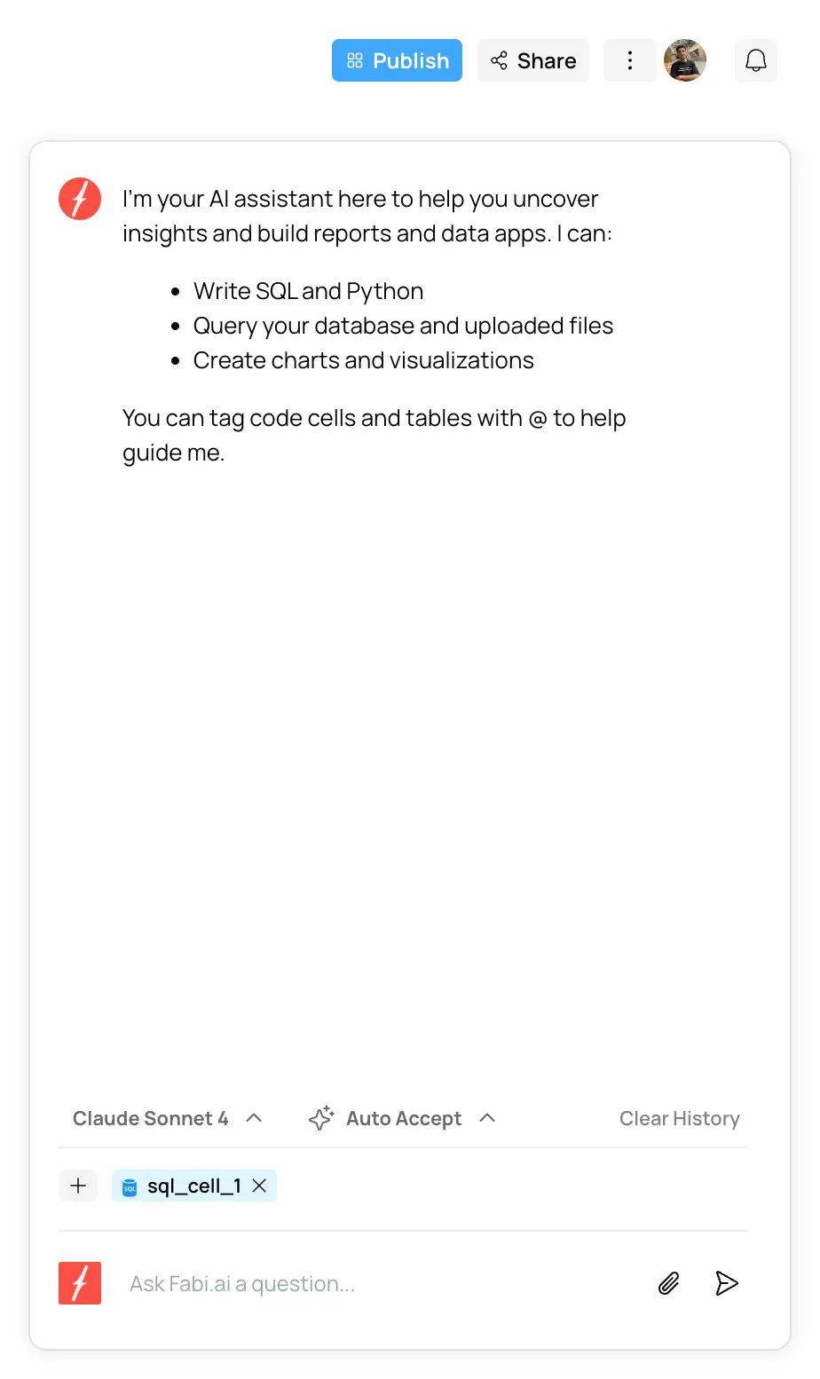
When you sign up, you get a clean dashboard. Maybe too clean—the sidebar won’t collapse, which bugs me.
But the important stuff is there: your smartbooks, reports, and links to docs if you get stuck.
The documentation is actually good. So is their YouTube channel. You’ll need maybe 30 minutes to learn the basics, even if you’ve never touched data analysis before.
To start, just click “New Smartbook.” That’s where you’ll do everything.
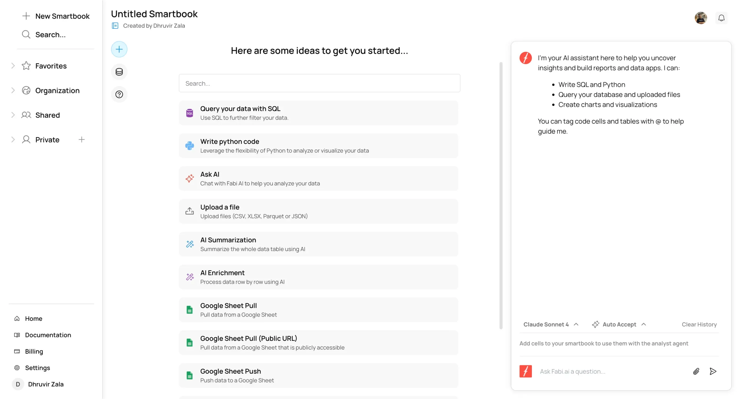
Here’s what makes Fabi.ai different.
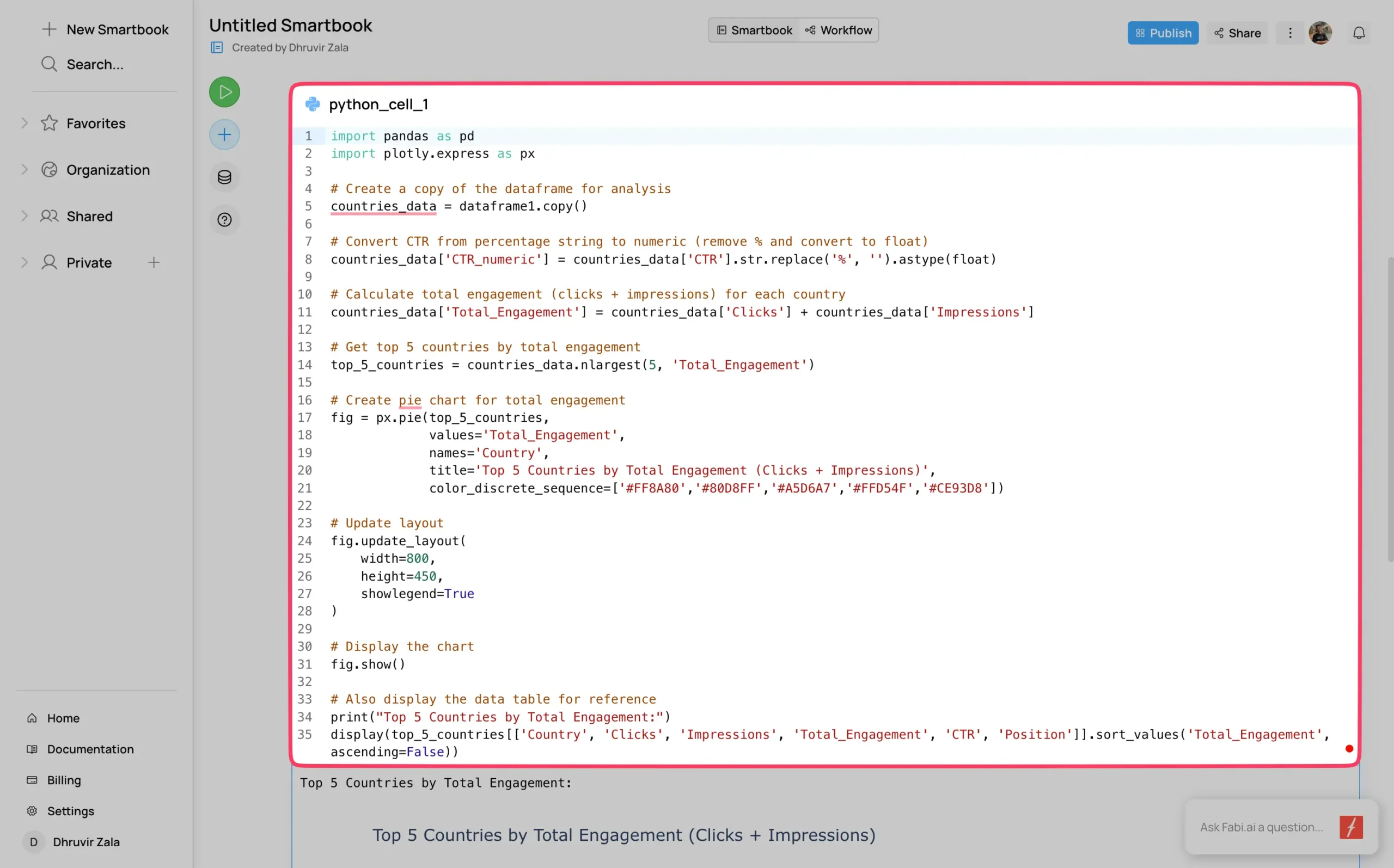
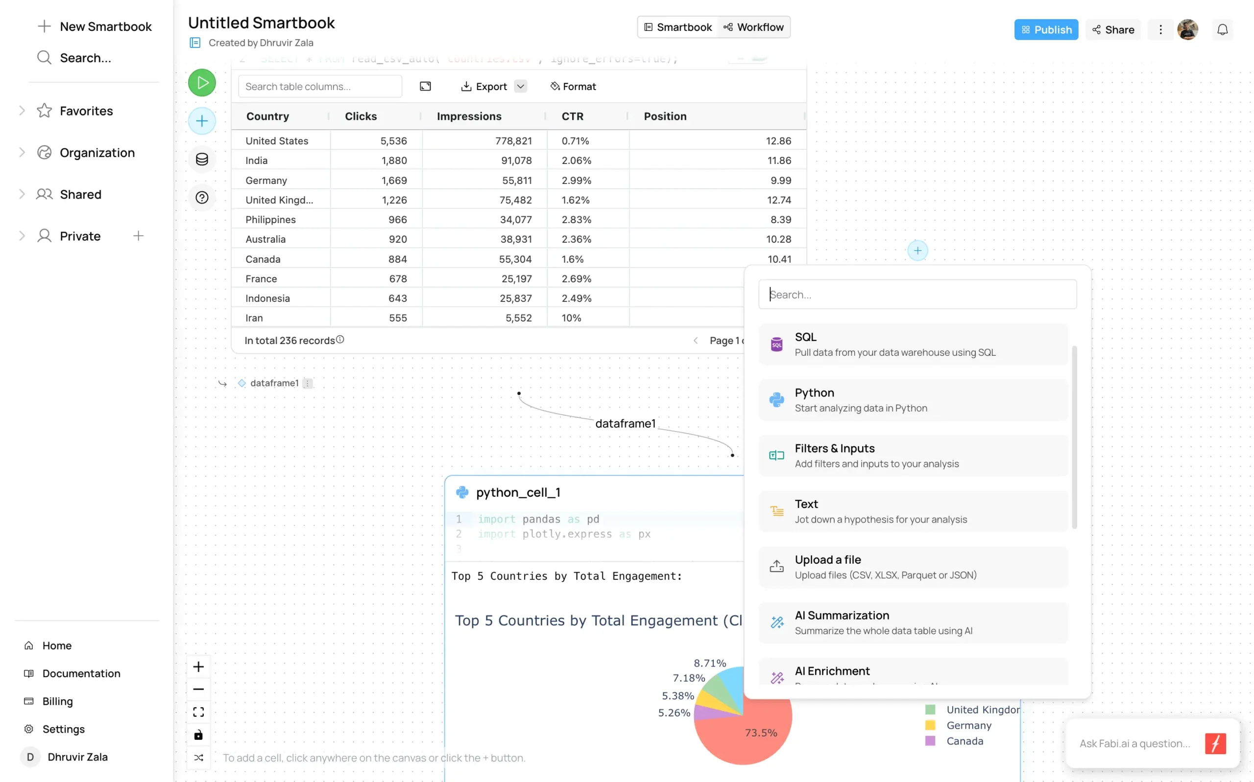
Upload a CSV file—I used my website’s traffic data from Google Search Console—and it instantly turns it into a clean table. Then it suggests what to do next.
But the real magic is the AI chatbox on the right. It’s not just another chatbot. This one actually understands data.
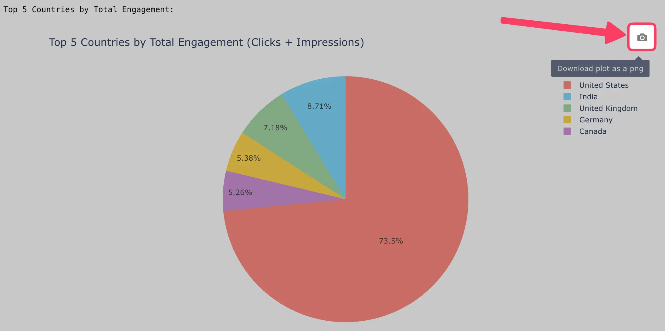
I asked it for a pie chart of my top 5 traffic sources. It made one in seconds. Not a template or approximation—the actual chart I wanted, with my actual data.
It also shows you the Python code it used.
You can edit the code and watch the chart change. Or copy it and use it somewhere else. That’s smart design—helping beginners while not handicapping experts.
You can even export charts as PDF images with one click.
The AI works with several models:
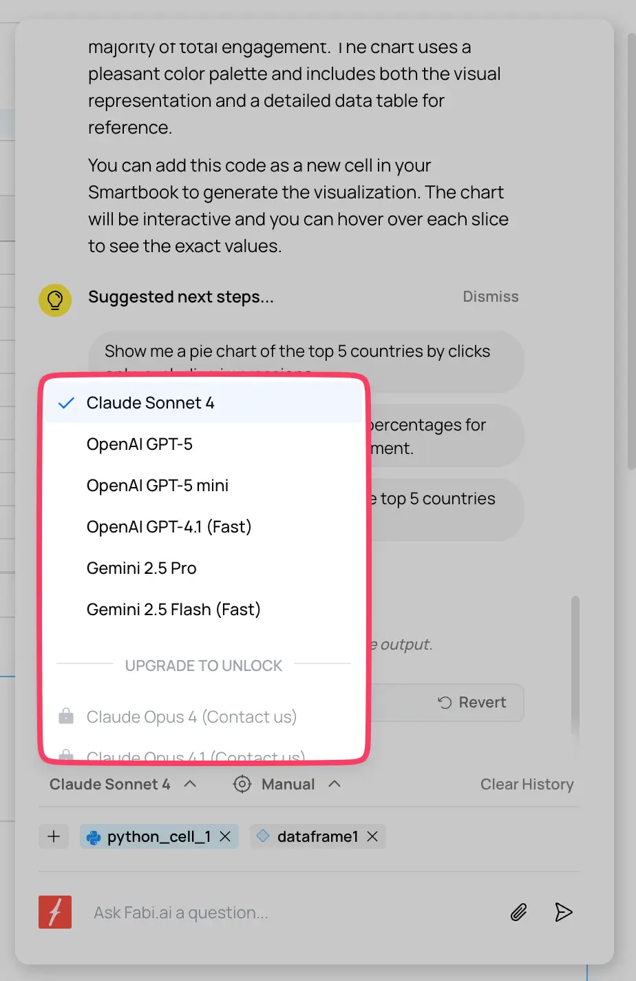
I mostly use Claude. It understands what I mean, even when I don’t explain it well.
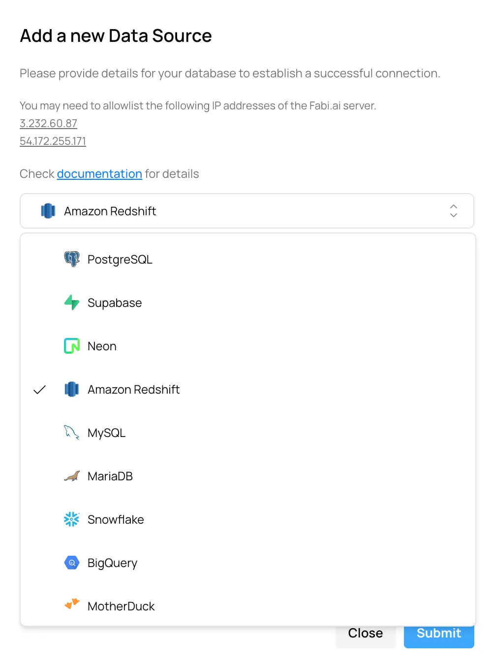
Most tools make you choose one data source. Fabi.ai ignores that rule completely.
Your sales data in Snowflake, marketing metrics in Google Sheets, customer feedback in a random Excel file—it treats them all like they’re part of the same database. Because they should be.
Basically, your data can live virtually anywhere.
With that said, let’s move on to Fabi’s Smartbooks.
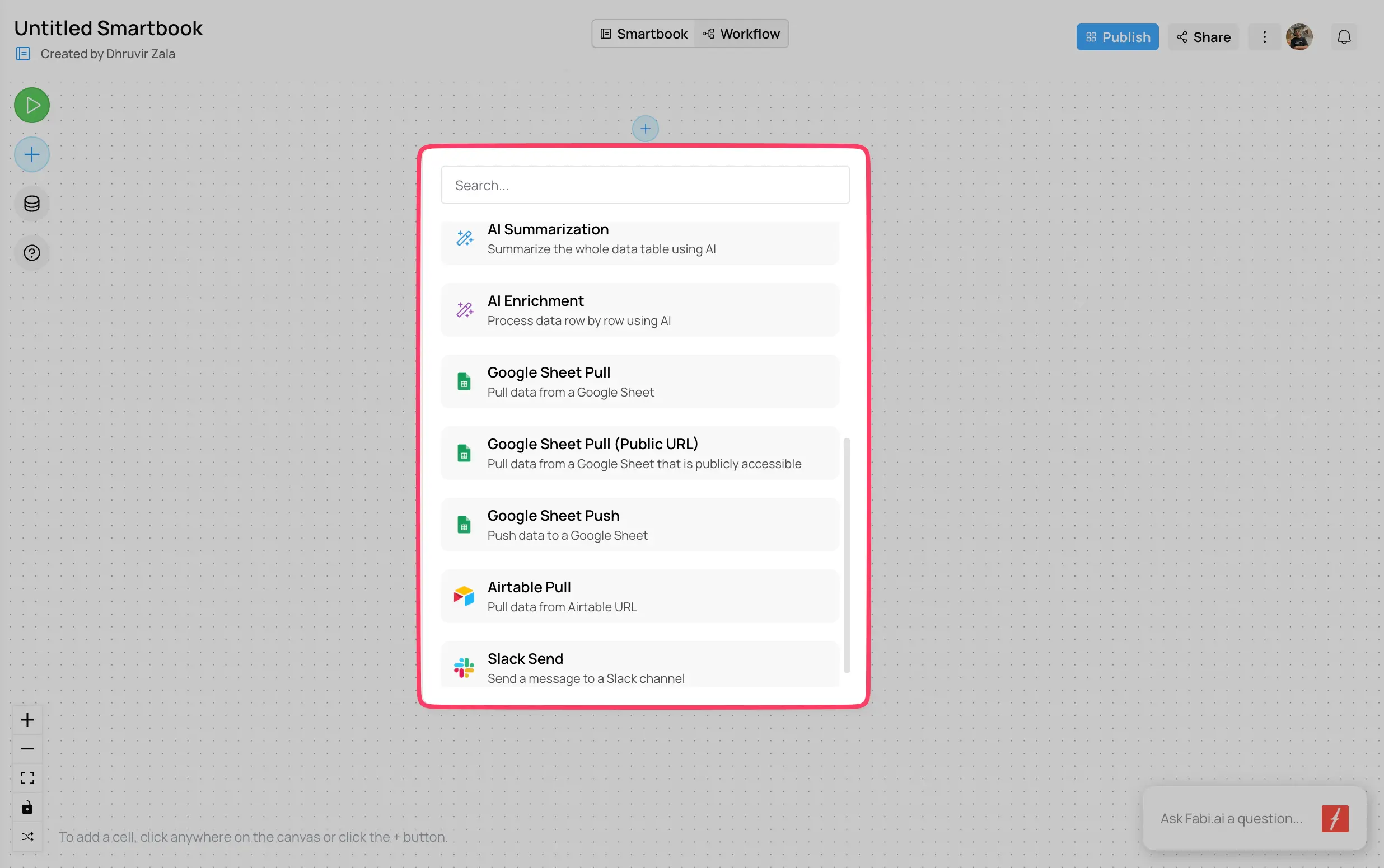
Smartbooks in Fabi.ai are like Jupyter notebooks that actually work. If you’ve used Jupyter, you know the pain: cells run out of order, variables get confused, everything breaks if you sneeze wrong.
Smartbooks fix these problems.
Moving on, Workflows are where Fabi.ai gets interesting for teams.
You can build workflows that:
For instance, I can build one that checks my traffic daily and messages me if something looks weird. Took 15 minutes.
The workflow builder uses “cells”—little blocks that do one thing each. Connect them together and you’ve got automation.
It’s like Zapier but for data.
If you’re on the Team plan ($199/month), collaboration actually works.
You can share Smartbooks with specific people or your whole company. Give them read-only or edit access. Comment on specific parts. Tag people to get their attention.
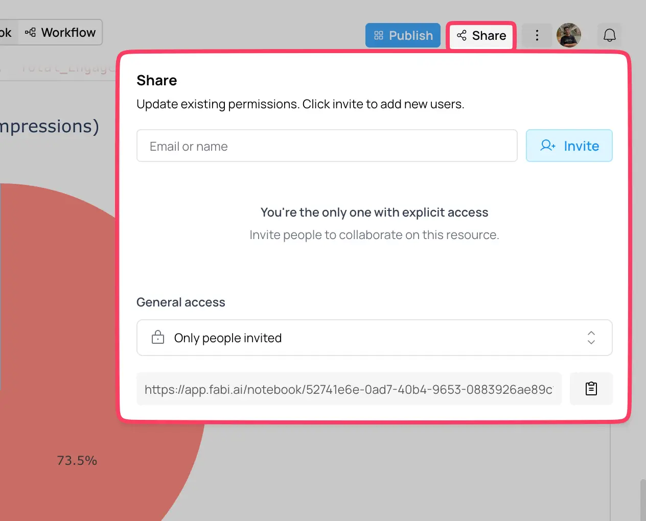
When two people edit the same thing, Fabi.ai tells you. No silent overwrites. No lost work.
The sharing is straightforward: click Share, type an email, choose permissions. Done.
Most data tools fall into two camps: too simple to be useful or too complex to actually use.
Fabi.ai found the sweet spot. Beginners can start immediately. Experts aren’t held back. The AI actually helps instead of getting in the way.
If you work with data—even just occasionally—try it. The free tier is enough to see if it fits your workflow.
(One tip: start with the documentation, not the video tutorials. The docs are better, faster and organized.)
Pricing
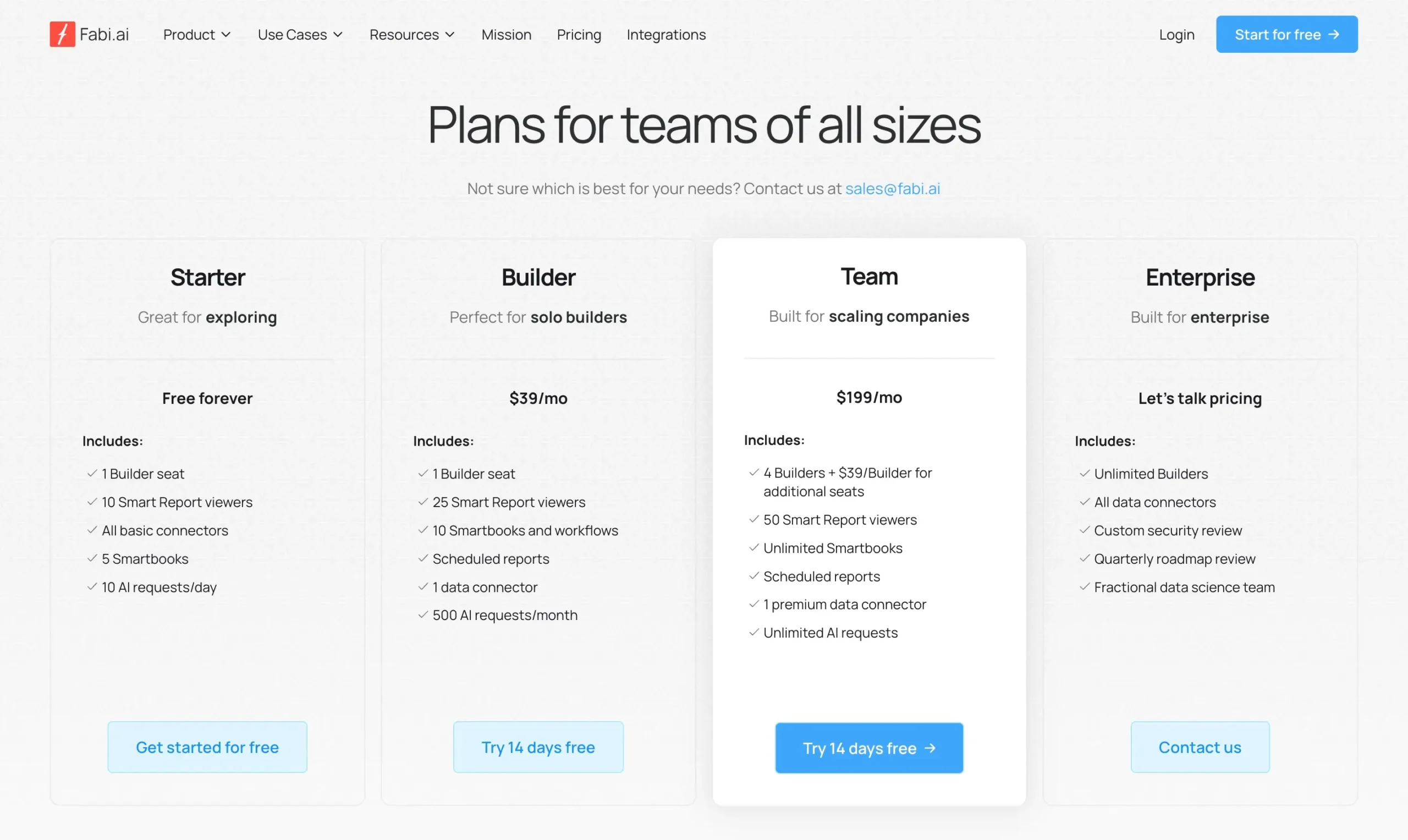
Fabi.ai offers four plans: Starter (free), Builder ($39/mo), Team ($199/mo), and Enterprise (custom).
Use code DHRUVIR for 20% discount on your first 3 months on Builder or Team plans.
File uploads: 100 MB (Starter), 400 MB (Builder), 1 GB (Team). Your annual data won’t fit in Builder.
Try free for a week. You’ll hit limits fast.
If solo, start with Builder (use the code) but budget for Team.
If you’re a company, buy Team immediately with the discount code. The unlimited AI requests justify the cost.
That “$199/mo” Team price? Add $39 per person after four. A 10-person team costs $433/month. The discount helps for the first three months, then budget for full price.
#2 — Julius AI
Available on: Web, Android, iOS.
Pros
Cons
Julius AI just became something completely different.
I’ve been using it for months to chat with spreadsheets. Upload a CSV, ask questions, get charts. Simple stuff.
Then they released Notebooks.
Everything changed.

You know how Jupyter notebooks break when you run cells out of order? Or how you lose track of what you did three weeks ago? Julius fixes both problems.
Here’s the thing: most AI data tools make you start over every time. Julius builds on what you’ve done before.
Notebooks are collections of steps (called cells) that let you automate complex tasks. But unlike Jupyter, these actually work. There are four types of cells that matter:
The magic happens when you combine them. Build a workflow once, use it forever.
But here’s where it gets interesting: remember uploading CSV files every time your data updated?
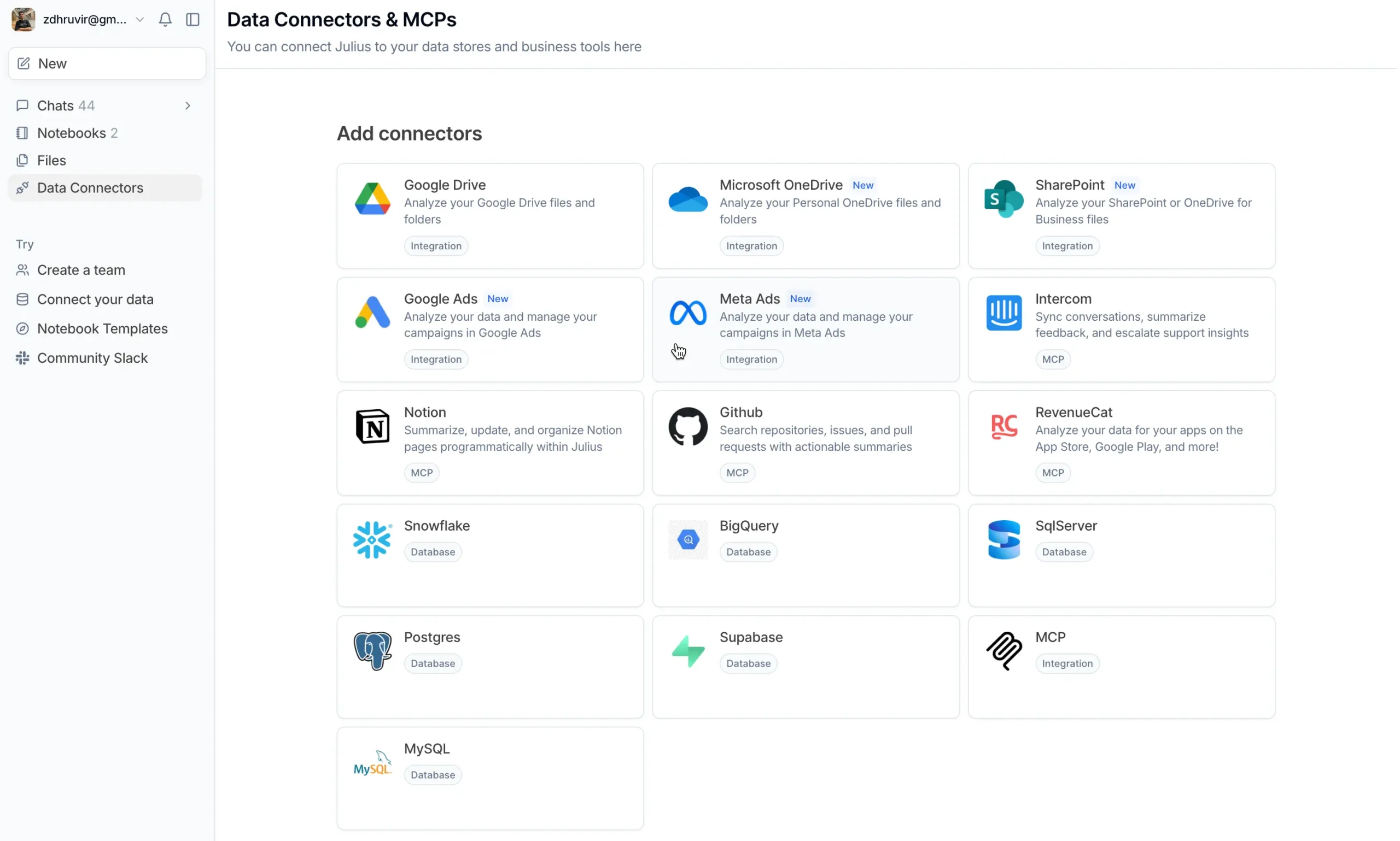
Julius connects directly to your databases now. PostgreSQL, BigQuery, Snowflake – all supported. Your analysis stays current because it pulls live data.
No exports, no outdated files.
The setup requires some technical knowledge (you’ll need database credentials), but once it’s connected, anyone on your team can use it.
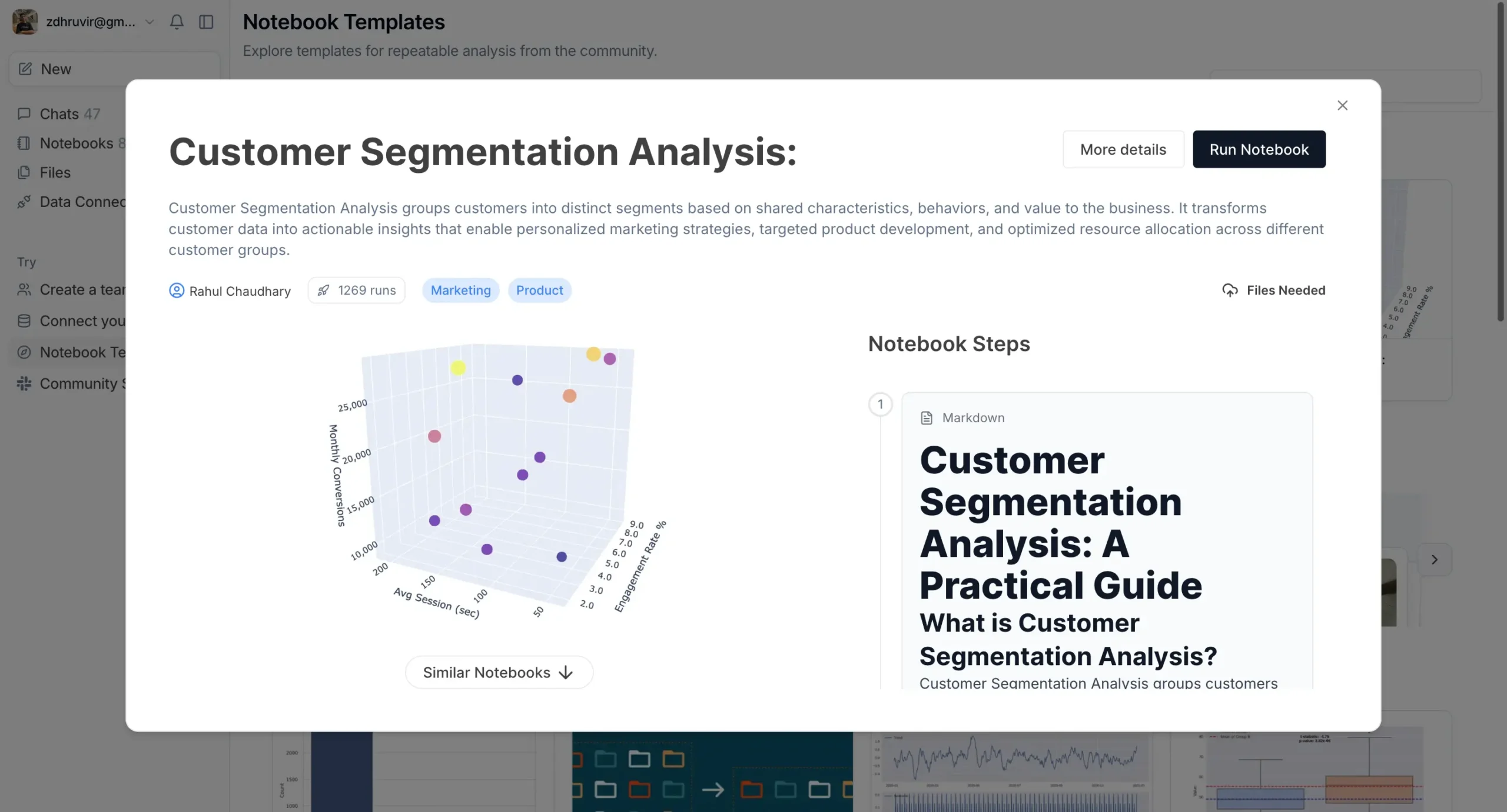
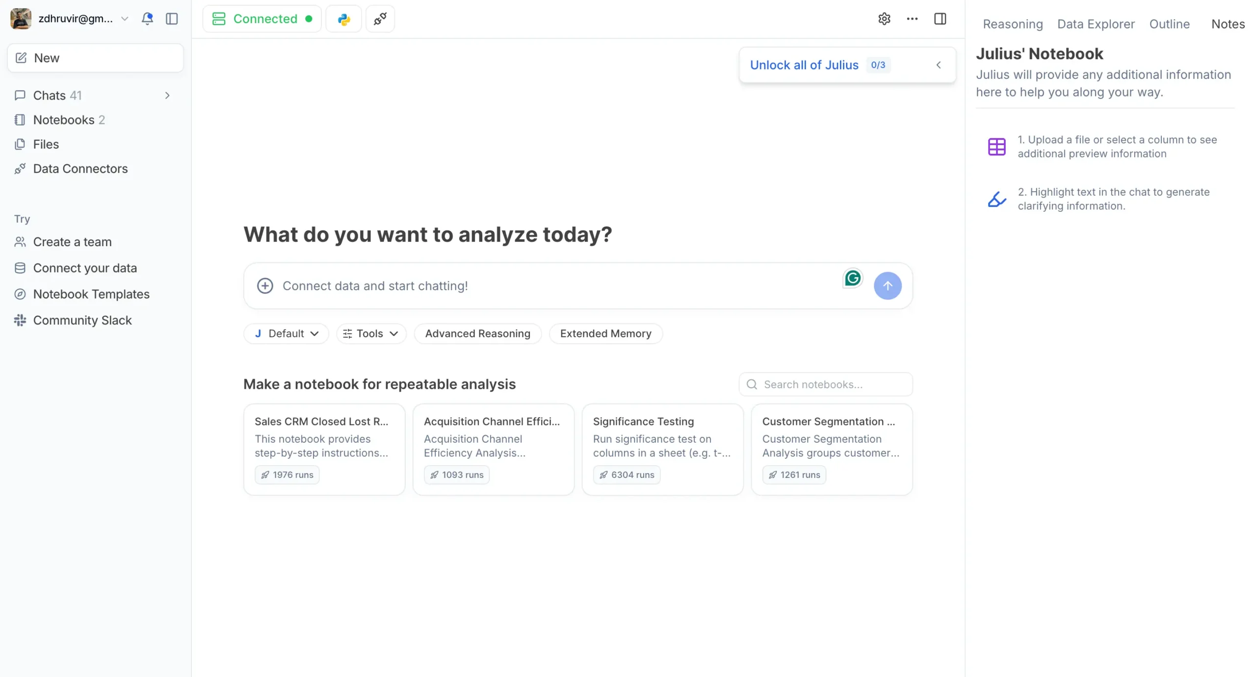
Even better, Julius provides ready-made templates for common tasks: customer segmentation analysis, sales performance reports, significance testing workflows, time series analysis. Pick a template, connect your data, and you’re analyzing within minutes.
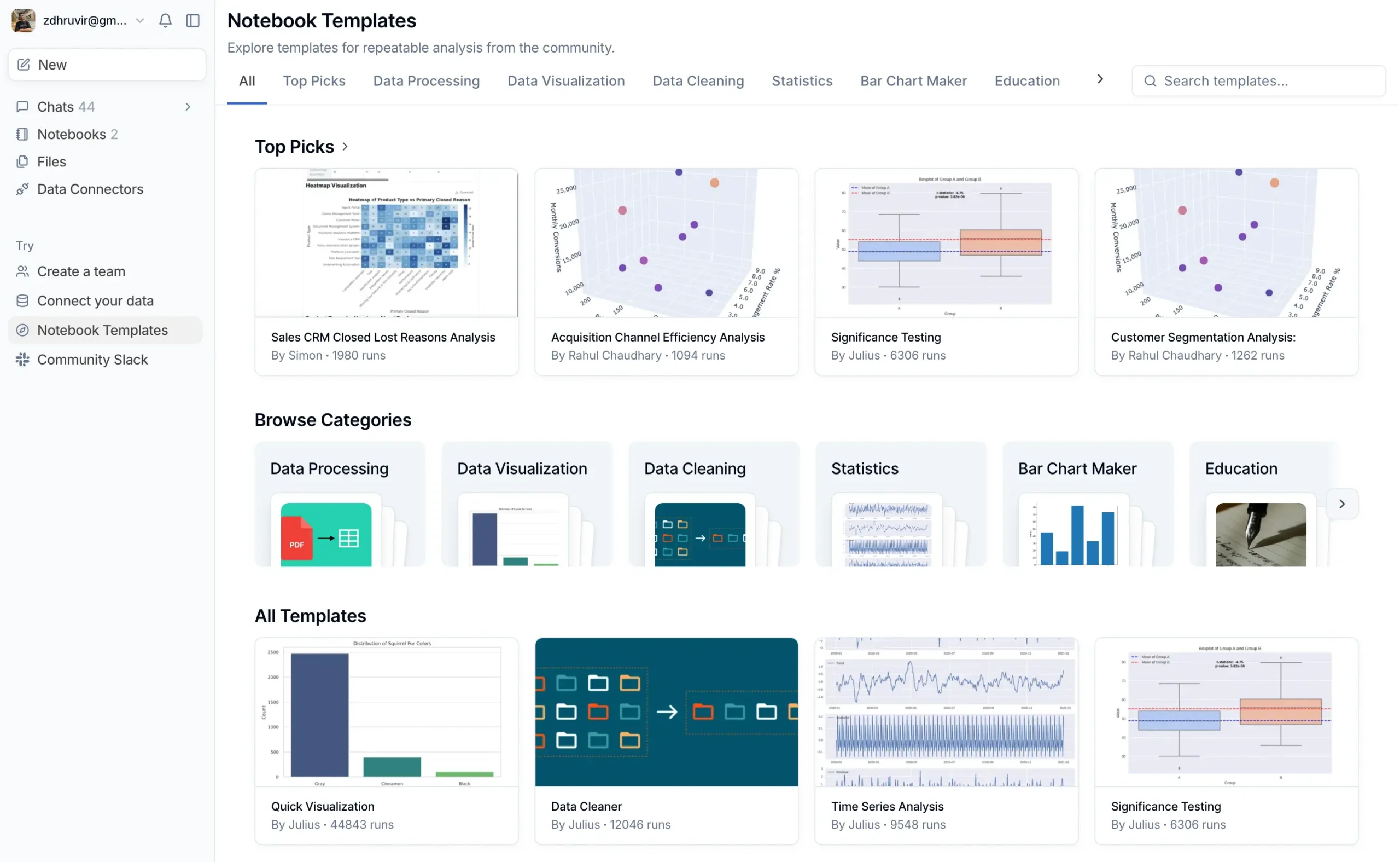
Each template includes explanations of what it does and why.
I used the “Customer Segmentation Analysis” template on our user data. Ten minutes later, I had customer segments I’d never thought to analyze.
There’s also something called Data Explorer that shows you what’s happening under the hood.
Every table, every transformation, every intermediate result. Click “Expand” on any chart, and you see the actual data powering it.
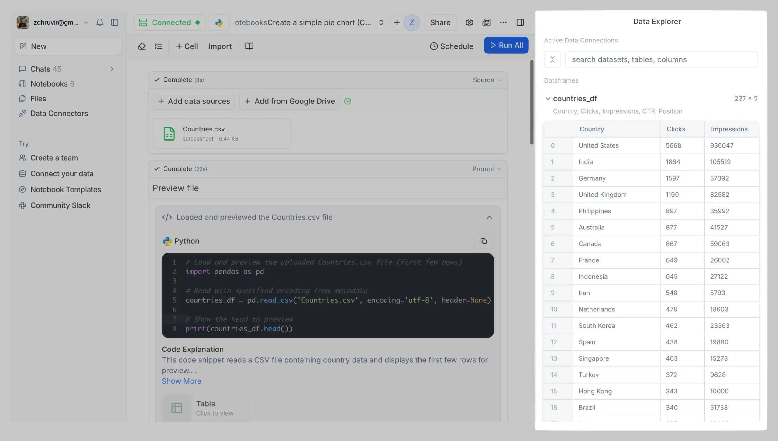
This matters when your CEO asks, “How did you calculate this?” You can show them the exact steps. Export the data, modify it, understand exactly what Julius did.
Julius now supports every major AI model too: Claude 4 Sonnet (my favorite for complex analysis), GPT-5, plus their own optimized models.
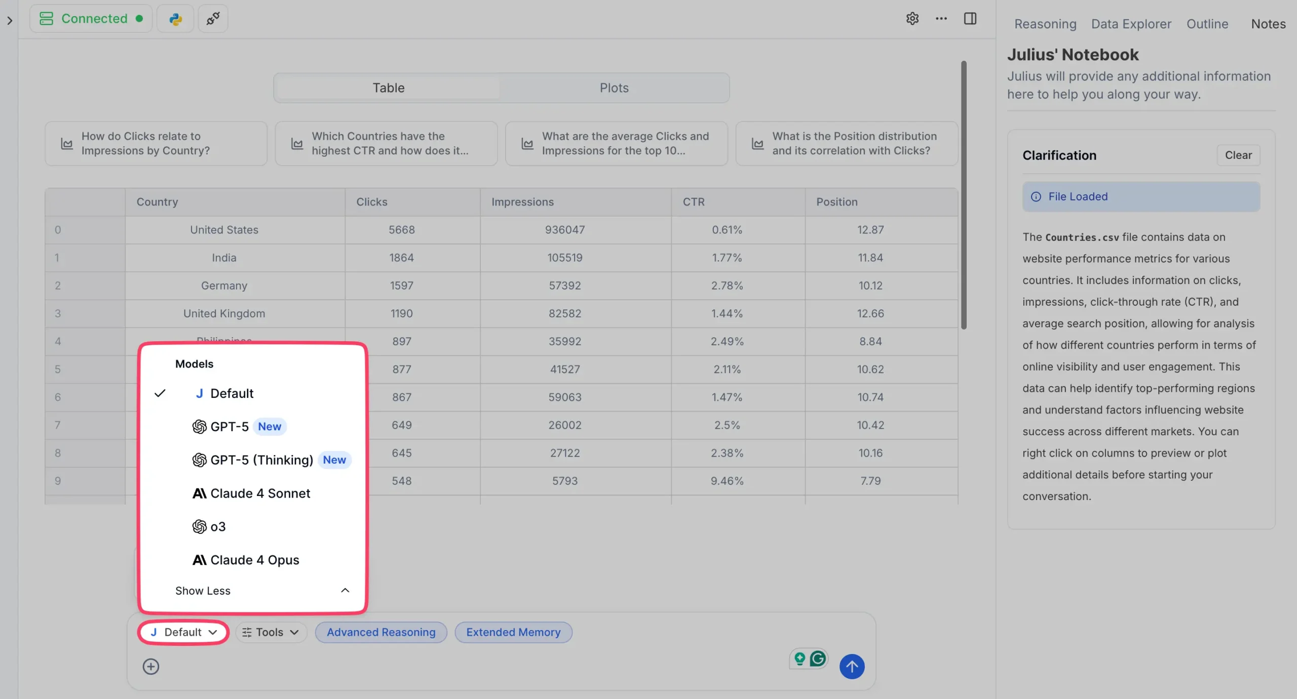
Different models excel at different tasks. Claude 4 is brilliant at understanding messy data. GPT-5 is fast for simple questions. Julius lets you switch between them instantly.
Julius solved the fundamental problem with data analysis: everything breaks when you try to scale it. Your spreadsheet analysis works once. Your SQL queries stop working when the schema changes. Your Jupyter notebook becomes unrunnable chaos after two weeks.
Julius builds systems that keep working.
The conversational interface is still there. You can still upload a file and chat with it. But now you can turn those conversations into lasting workflows.
Use Julius when you need the same analysis repeatedly (monthly reports, performance reviews), your data lives in databases instead of spreadsheets, you want to build analysis workflows that teammates can use, or you’re tired of recreating the same charts every month.
Don’t use Julius if you just need a quick one-off chart (use Infogram), you prefer writing your own code from scratch (use Claude), or your data is simple and never changes (any tool works).
Julius bridges the gap between “quick chart” and “data science platform.”
Pricing
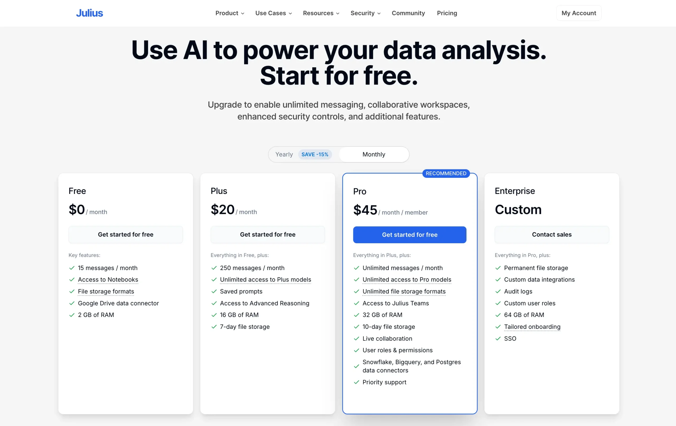
Julius has updated their pricing to reflect the new capabilities:
Free Plan | $0: 15 messages per month, basic features, Google Drive connector. Good enough to test it out.
Plus Plan | $20/month: 250 messages, unlimited access to Plus models, saved prompts, Advanced Reasoning. This is where most individuals will land.
Pro Plan | $45/month: Unlimited messages, 32 GB RAM, access to all models, plus the database connectors (Snowflake, BigQuery, PostgreSQL). Teams need this.
Enterprise | Custom: Everything in Pro plus custom integrations, dedicated support, audit logs, and tailored onboarding.
Academic Discount: Students, professors, and teachers get special discounts. Email team@julius.ai with proof of academic status.
Use code DHRUVIR at checkout for a 10% discount on any paid plan.
Read my complete Julius AI review.
#3 — Claude
Available on: Web, Android, iOS, macOS, and Windows.
Pros
Cons
Most people know Claude as an AI writing assistant. I use it for articles, emails, and social posts too.
But here’s what’s interesting: it’s secretly great at data visualization.
Why?
Because it thinks like a programmer, but talks like a friend.
Here’s what I mean:
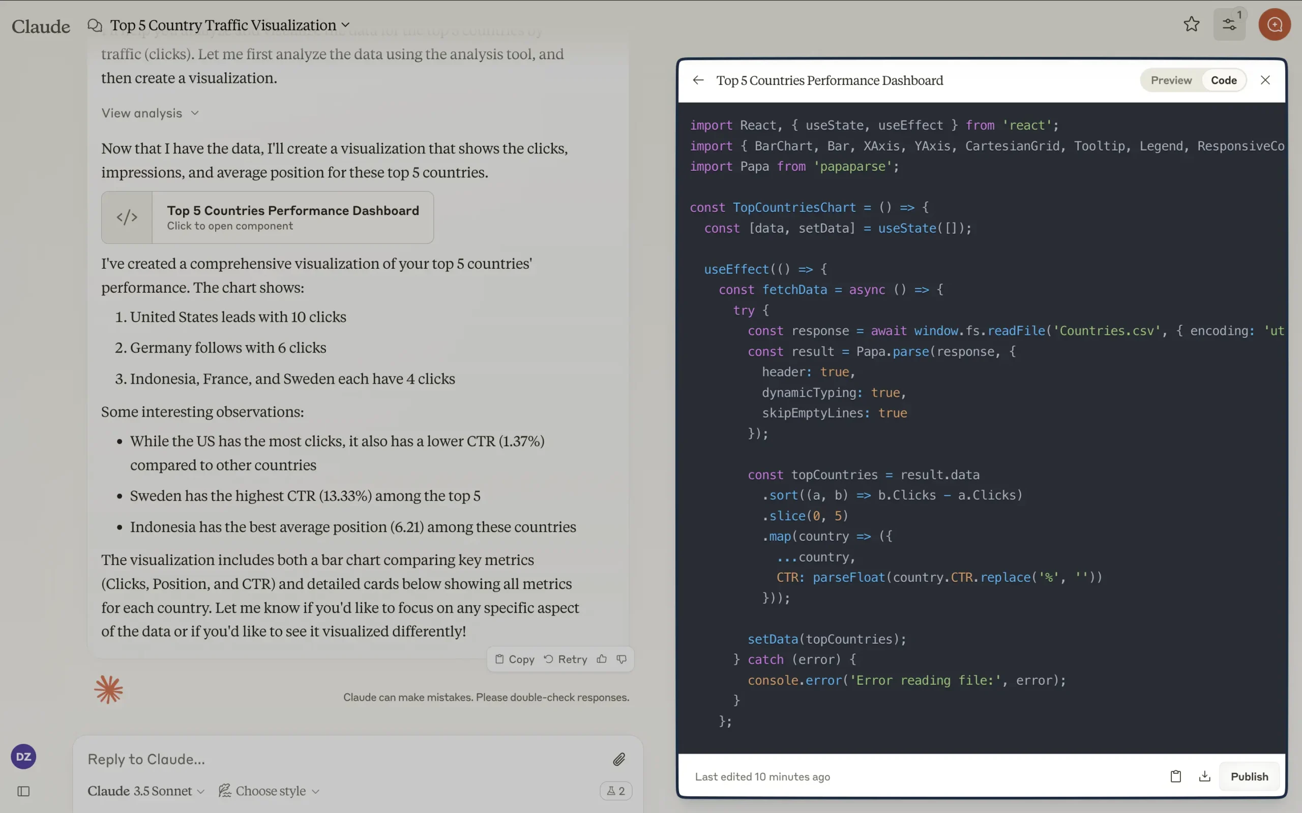
I uploaded a spreadsheet with my website’s traffic data. Then I simply asked Claude to show me my top traffic sources. No coding. No configuration. Just a normal conversation.
Seconds later, I had both a detailed analysis and an interactive visualization.
The visualization shocked me.
Not just because it was beautiful—though it was—but because it was interactive. I didn’t even ask for an interactive bar graph. Claude just knew it would help tell the story better.
Claude even gave me the complete React JS code behind the visualization. For techies, this is gold. You can take that code and build something even better.
That’s the catch, though. If you’re not technical, implementing these visualizations requires work.
You can screenshot the static images easily enough, but the interactive features need coding knowledge.
Yet there’s another way Claude helps: it’s a visualization consultant.
Upload your data and ask, “What’s the best way to visualize this? List down all the possible ways.” Claude will explain your options, complete with pros and cons for your specific case.
This matters because most tools just give you a menu of chart types. Claude understands your data and helps you make smarter choices.
Think about that. An AI that not only creates visualizations but teaches you how to think about data presentation.
Pricing
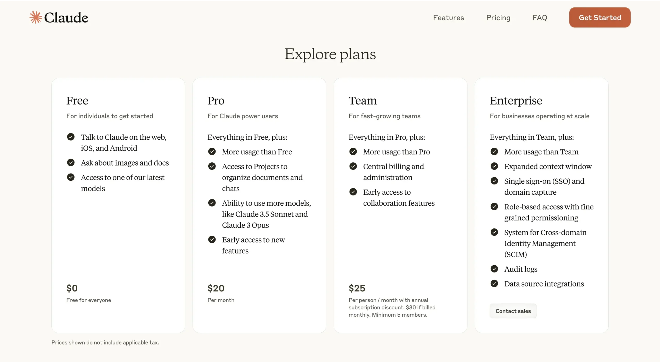
Unlike Julius AI, Claude offers a limited but forever free plan.
However, direct comparisons are tricky since Claude is a general-purpose AI assistant while Julius AI is a specialized data analysis platform.
Free Plan | $0: Perfect for individuals exploring AI capabilities. Includes document and image analysis plus one of Claude’s latest models.
Pro Plan | $18/month (annual) or $20/month: Expanded usage limits, access to advanced models like Claude 3.5 Sonnet and Claude 3 Opus. Features Projects organization and early access to new features.
Team Plan | $25/month per member (annual) or $30/month: Enhanced capabilities with central billing, administration tools, and early access to collaboration features. Minimum 5 members required.
Enterprise Plan | Custom pricing: Full-featured solution with expanded context window, SSO, domain capture, RBAC, SCIM, audit logs, and data source integrations. Contact sales for details.
Note: Prices exclude applicable taxes. The annual Pro plan is currently available in the U.S. only.
#4 — Zoho Analytics
Available on: Web, iOS, and Android.
Pros
Cons
Zoho Analytics is a Business Intelligence platform that turns messy data into instant insights through AI.
Let me tell you why that matters.
Remember how Julius AI and Claude excel at conversational data analysis?
Zoho Analytics takes a different path. It’s not trying to chat with you about data—it’s trying to connect your data universe.
Zoho Analytics links to over 500 data sources. Think about that.
Zoho could pull data from everywhere: databases, cloud services, and even OpenAI’s external datasets.
At the heart of this system is Zia, their AI assistant.
But Zia isn’t like Claude’s friendly chat interface. It’s more like a report-generating machine. Give it data, and it spits out widgets, forecasts, and anomaly reports.
Speaking of visualizations, they’ve got over 50 types.
Unlike Julius AI’s template-based approach, Zoho gives you a drag-and-drop interface. It’s powerful, but it’s also where things get interesting.
I tested it with the same website traffic data I used with Claude and Julius AI. The process was different.
First, you import your file into what looks like a spreadsheet on steroids.
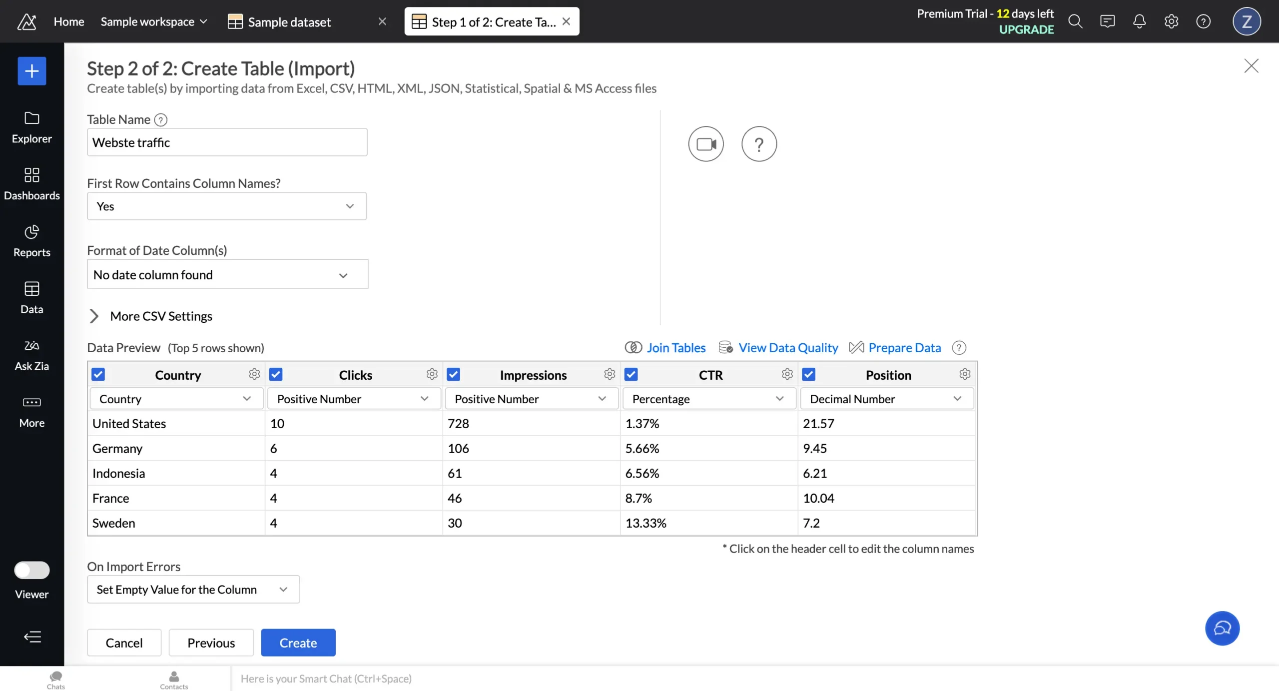
Then comes the real magic. One-click, and you’re in a full-blown data editor.

The left sidebar reveals Zoho’s true power.

But let’s focus on ‘Ask Zia.’ Unlike Claude’s open-ended conversations, Zia gives you suggested questions based on your data. Ask anything, hit enter, and boom—interactive visualization.
Here’s what makes it special: you can instantly switch between chart types and get AI-powered insights on the fly.
But here’s the truth:
I still prefer Julius AI and Claude for most tasks.
Why?
They feel natural. Zoho Analytics, despite its power, feels like a BI platform first, AI assistant second.
It’s not for everyone. If you want to just talk to your data, stick with Julius AI or Claude. They’re simpler, faster, more intuitive.
But Zoho Analytics shines when your data lives in twenty different places and you’re tired of playing connect-the-dots.
Pricing
Zoho Analytics offers a limited free plan and a 15-day free trial on the following paid plans:
Basic | $12/member/month: You get 500,000 rows – enough for most small business needs. Starts with 2 members.
Standard | $25/member/month: This is where it gets serious. 1 million rows and starts with 5 members. Most growing businesses land here.
Premium | $50/member/month: The power user plan. 5 million rows, starting with 15 members.
There’s also an Enterprise plan with custom pricing. But if you need 50 million rows and 50+ users, you probably already have someone handling these negotiations.
Two things worth knowing:
#5 — Infogram
Available on: Web.
Pros
Cons
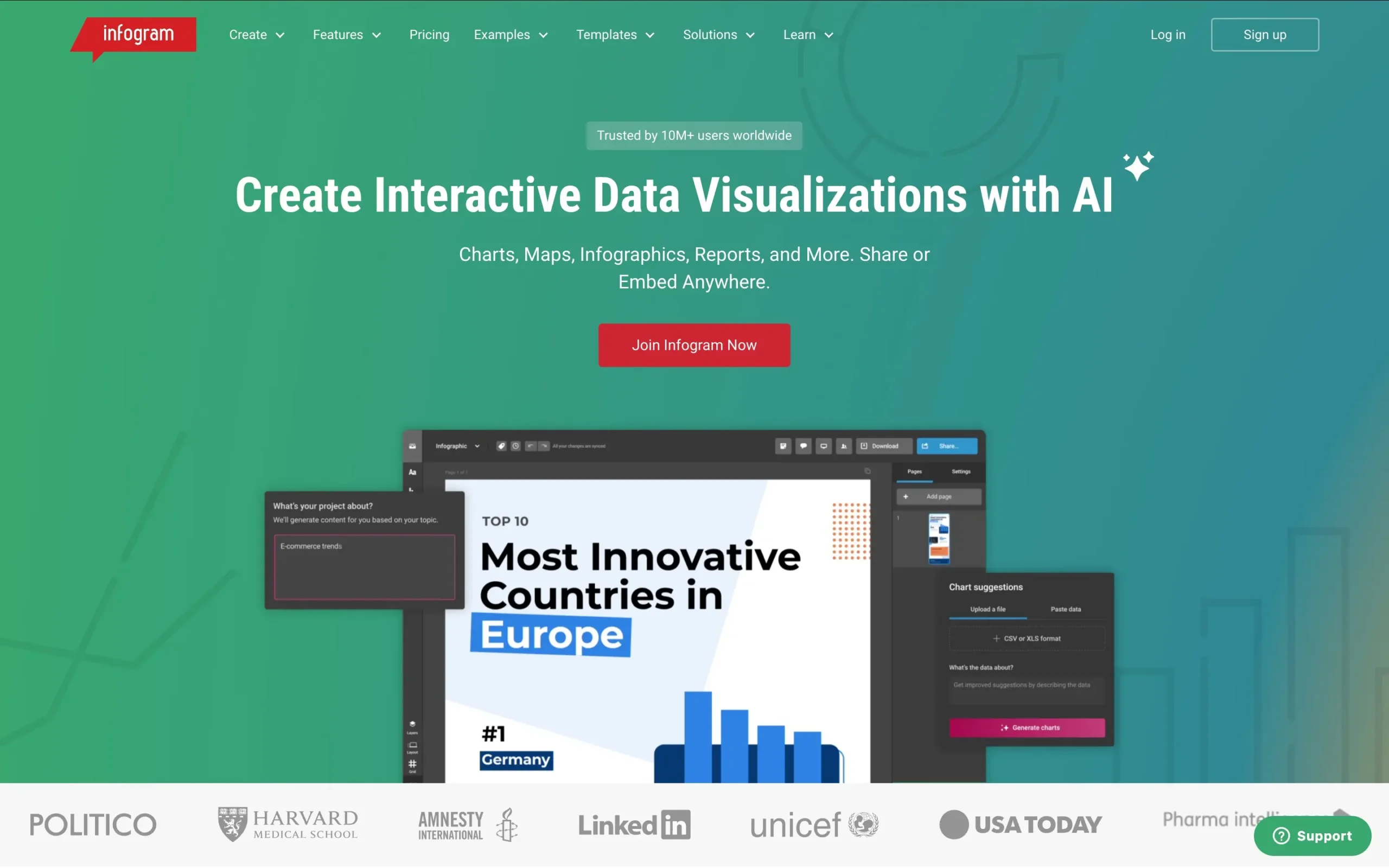
Infogram turns spreadsheets into stories. It is like Canva but obsessed with data.
Remember how Claude needed specific prompts for visualization suggestions?
Infogram just knows. Upload a spreadsheet, and it instantly transforms your data into the perfect chart type.
I tested it with my website traffic data—the same data I will use on all the other tools for the sake of simplicity.
Within seconds, Infogram generated an interactive line graph that told the story better than I could have imagined:
Unlike Julius AI’s template-based approach or Claude’s code-heavy output, Infogram gives you complete control without requiring technical knowledge.
Click on any chart, and you enter what I call the “visualization playground.”
The customization options are staggering. Change colors, switch between 35+ chart types, or transform your data into any of 800+ map variations.
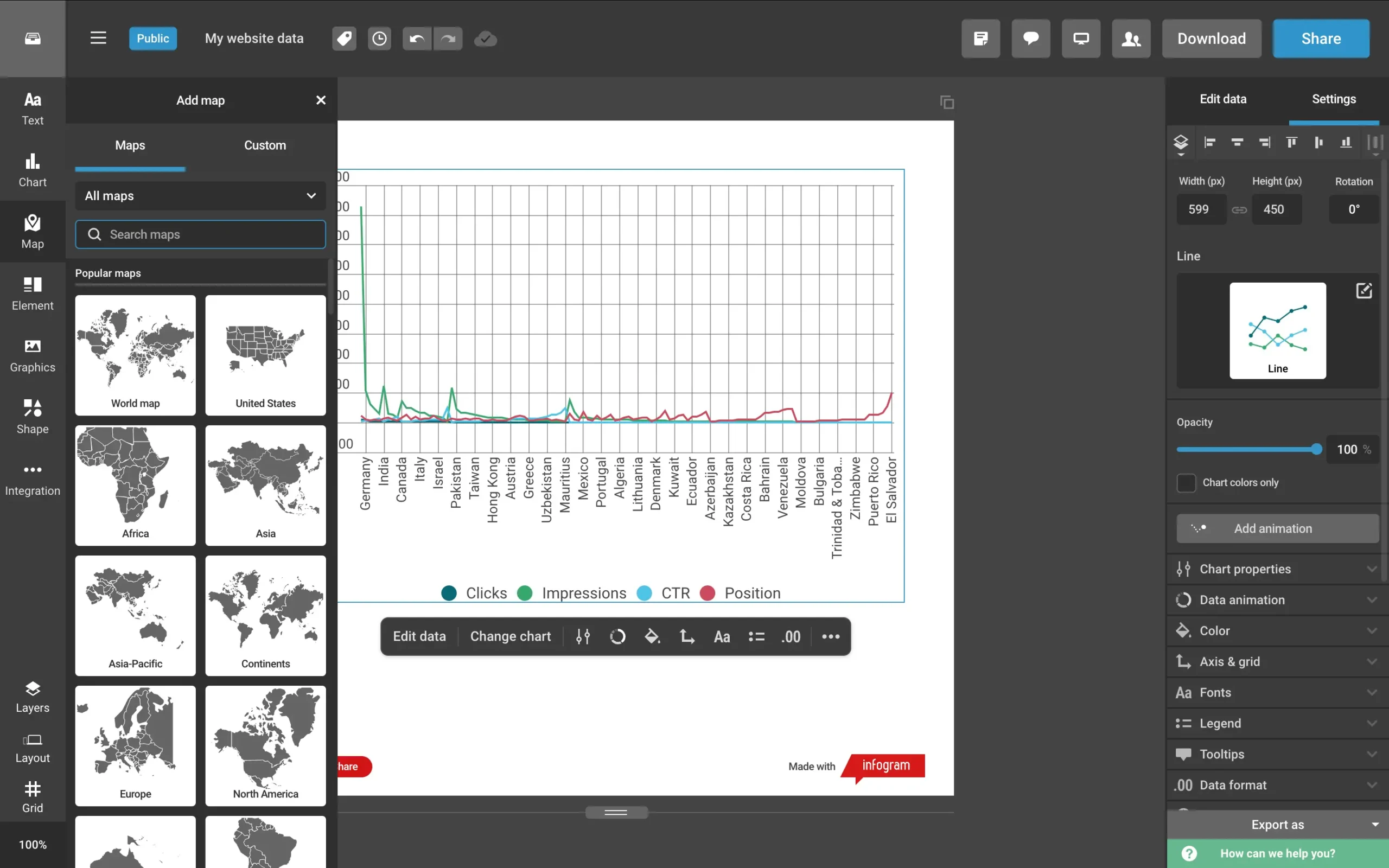
Want AI suggestions? Just ask.
Need to edit your data? Click and type.
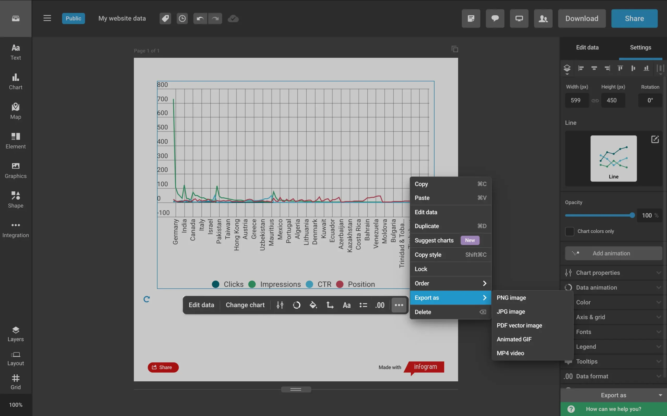
But here’s what sets it apart: exporting.
Remember the export headaches with Julius AI and Claude?
Infogram solves this beautifully. One-click exports your visualization as:
Infogram connects to everything: Excel, CSV, Google Drive, Dropbox, JSON feeds, and even enterprise databases like Amazon Redshift and Oracle.
Then there’s the infographic generator. Tell it your story, click once, and watch:
Pure magic. The AI creates customizable infographics that look professionally designed.
For teams, Infogram includes collaboration features that make group projects feel natural. It’s like they studied every pain point in data visualization and systematically eliminated them.
Pricing

Infogram offers five plans that scale with your visualization needs. Save 24% by paying annually.
Basic | Free: Includes 35+ chart types, and 13 map types, and supports up to 10 projects with 5 pages each. Best for individuals exploring data visualization.
Pro | $25/month: The sweet spot for freelancers and content creators. Adds 800+ map types, premium templates, HD exports, and live data connections. Supports up to 100 projects with 10 pages each.
Business | $79/month: Built for growing businesses. Includes custom branding, SQL connectors, version history, and unlimited pages per project. Handles up to 1,000 projects.
Team | $179/month: Designed for small teams (3-10 members). Adds real-time collaboration, content analytics, and project commenting. Supports up to 3,000 projects.
Enterprise | Custom pricing: Full-featured solution with multiple teams, SSO, API access, dedicated account manager, and up to 10,000+ projects. Includes personalized training and 99.9% uptime SLA.
Note: Prices exclude VAT, which varies by location. A valid VAT number can be provided for business purchases.
#6 — Datapad
Available on: Web.
Pros
Cons
Datapad strips away the complexity that makes data tools intimidating. Think of it as Julius AI’s younger, friendlier sibling.
The magic starts with connections. Datapad links to over 20 data sources – from Google Analytics to TikTok Ads.
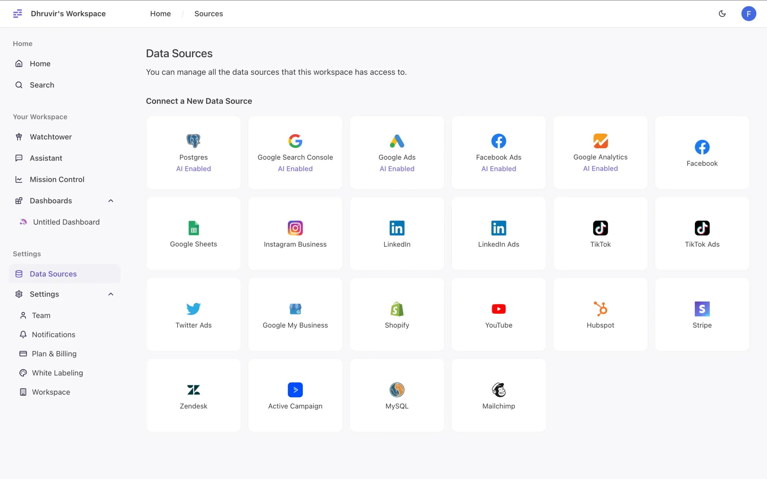
Unlike Claude’s file-by-file uploads or Zoho’s complex integrations, connecting takes seconds.
But here’s where it gets interesting: Watchtower.
Remember how Zoho’s Zia predicts what you want to know?
Watchtower goes further. It watches your data 24/7, hunting for patterns and anomalies.
I tested this with data from an old website’s Google Analytics. Within minutes of connecting, Watchtower spotted something I’d missed: a 28% drop in daily sessions.
The interface feels different too. While Zoho Analytics bombards you with options, Datapad gives you one thing: a simple input box.
Ask anything. Get instant visualizations.
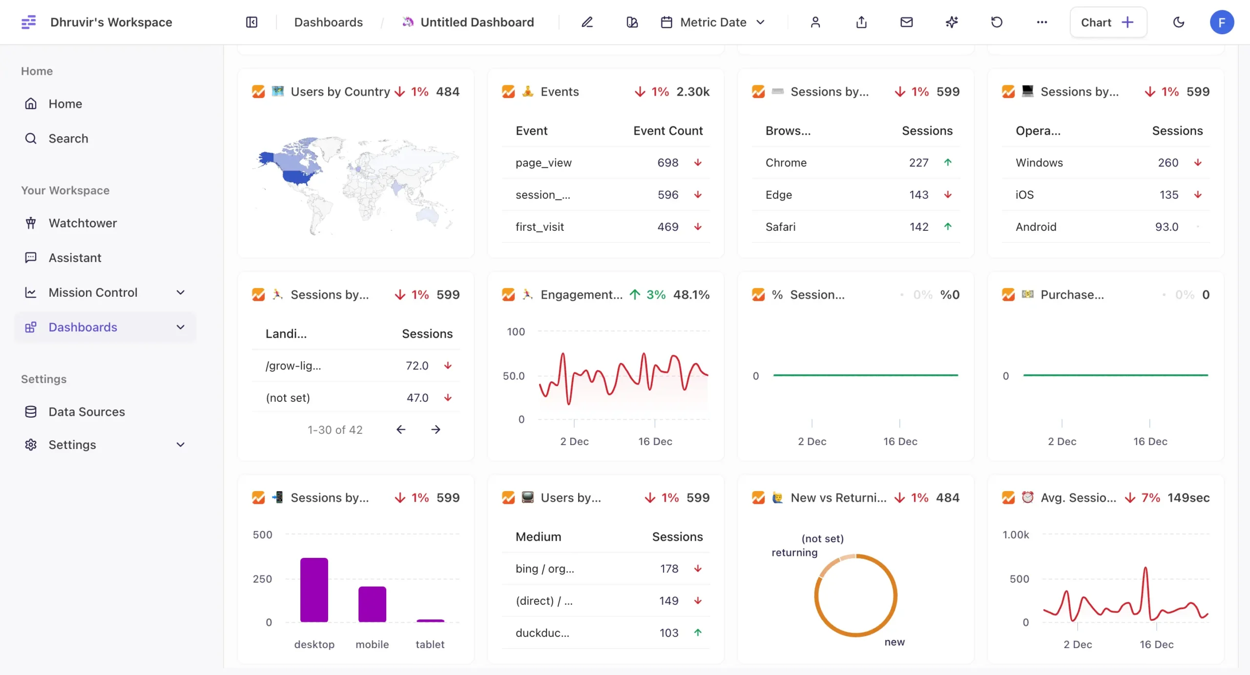
The dashboards reflect the simplicity too. Datapad lets you drag and drop key metrics into clean, minimal layouts.
Team features are just as straightforward. One-click invites collaborators.
But there’s a catch.
Remember how Infogram lets you export visualizations in five formats?
Datapad makes this surprisingly hard. That’s why, despite its potential, it lands at #5 on our list.
Datapad shows where AI visualization tools are heading: toward simplicity and automation. It’s not the most powerful tool I’ve seen, but it might be the easiest to use.
Pricing
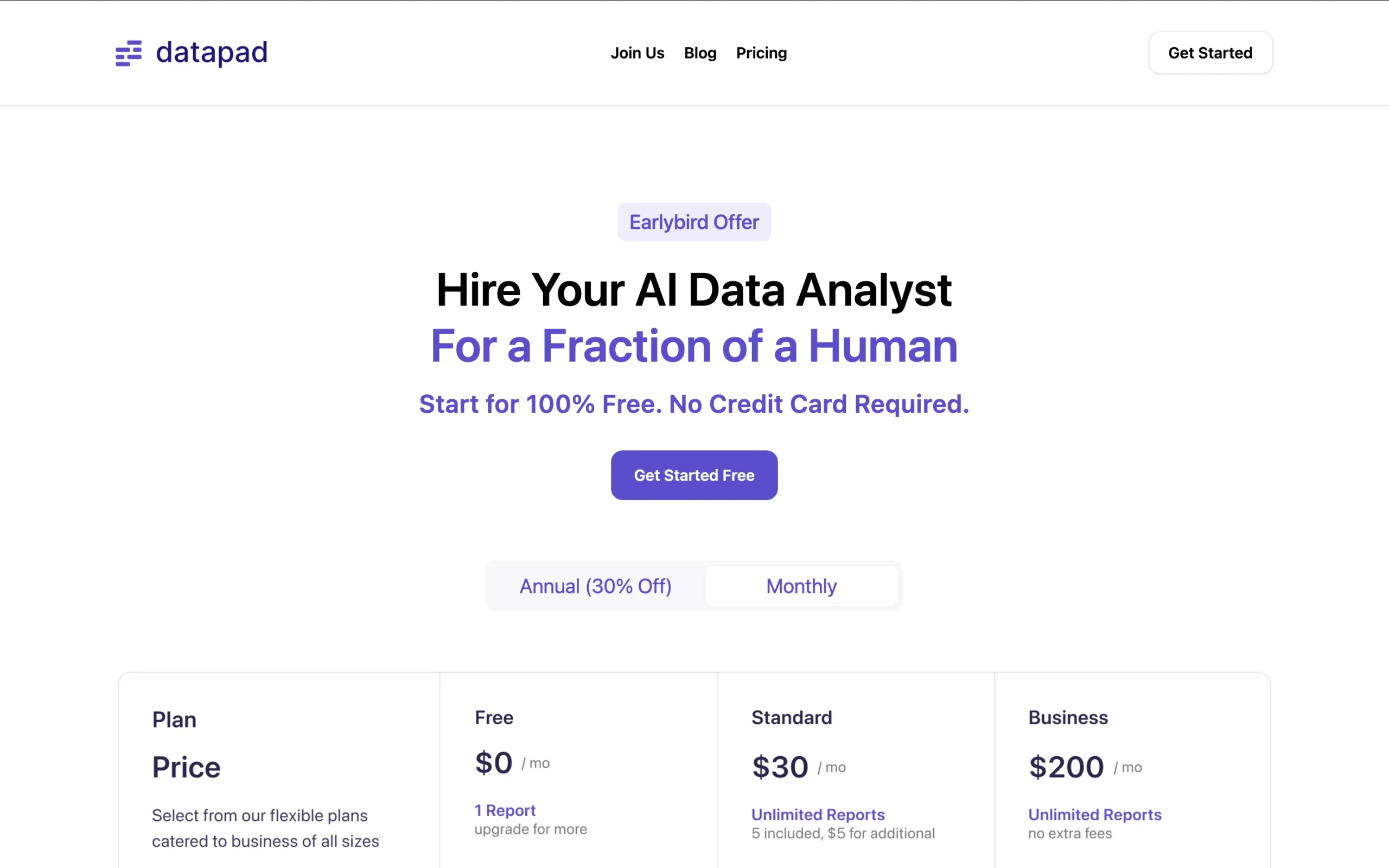
Datapad offers a forever-free plan with unlimited data sources but limited to 1 report.
Their Standard plan at $30/month includes 5 reports (additional reports at $5 each) and automated reporting features.
For larger operations, the Business plan at $200/month unlocks unlimited reports, white-labeling, priority support, and a dedicated account manager.
All plans include unlimited users and real-time data sync.
They’re currently running an early bird promotion, positioning their AI data analysis capabilities as a cost-effective alternative to hiring a human analyst.
NOTE: New members can try any paid plan free for 14 days without a credit card.
Choose Your Perfect AI Visualization Tool
After testing everything, two tools stand out:
Julius AI for most people. The Notebooks feature builds workflows that keep working. Database connectors eliminate CSV hell. Latest AI models understand your data better. If you’re doing regular analysis or building dashboards teammates can use, start here.
Fabi.ai for teams that live in collaborative notebooks. Reactive cells that actually work, unlike Jupyter’s chaos. Auto-syncs to Slack and Google Sheets. More expensive, but worth it if your team builds analysis together.
The others have their place: Claude for custom code, Zoho for enterprise complexity, Infogram for pretty exports.
But Fabi.ai and Julius AI solve the real problems most people face with data.
Disclosure: Our content is reader-supported. If you click on certain links we may make a commission.

Meet your guide
Dhruvir Zala
I help businesses and professionals stop wasting money on the wrong software. Most software reviews are just marketing in disguise. So I started writing the reviews I wish I had: thoroughly tested, brutally honest, and focused on what matters.